

LOGO IDENTITY
To build a strong, recognizable brand, Downtown Nutrition includes a versatile logo system. Each version helps the brand stay consistent and memorable across signs, cups, social media, and more.
-
A simple, memorable symbol that captures the brand’s fresh and natural vibe—ideal for use on social media, app icons, packaging, and small-scale branding where instant recognition is key.
-
A bold, modern typographic logo designed for versatility and clarity—perfect for signage, packaging, menus, and digital branding where strong name recognition matters
-
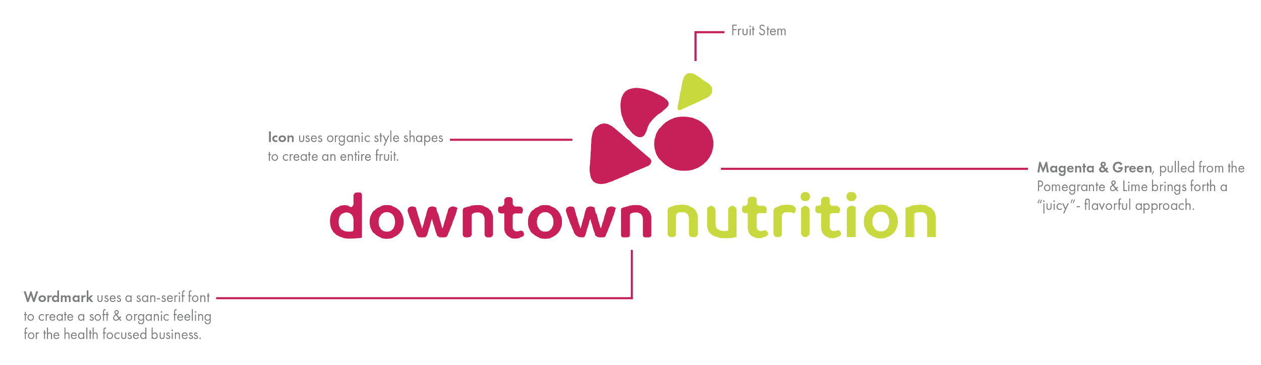
A balanced combination of the lettermark and logomark, designed for maximum brand impact and consistent use across signage, advertising, and marketing materials

Sticker Labels for Flavor Indication
ALTERNATE LOCKUP
Each alternate lockup was designed to replicate a bowl of assorted fruit. These designs are primarily used for stickers and other product merchandising.
-
This icon represents a bowl of raspberries, one of the key ingredients in Downtown Nutrition’s “Packful Punch Smoothie”
-
This icon represents a bowl of oranges, a key ingredient in Downtown Nutrition’s “Sunrise Citrus Smoothie”
-
This icon represents a fresh lime, one of the signature ingredients in Downtown Nutrition’s “Zesty Lime Refresher”
DOWNTOWN NUTRITION
VIBRANT. PASSIONATE. FRIENDLY.
Downtown Nutrition is a local juice & smoothie bar that aims to sell a variety of on the go drinks for the urban people.
When brainstorming ideas for a new company logo, it was important to experiment with a variety of different styles. Originally a more stylistic approach was chosen upon until further research pointed towards their company goals & key values.
IDENTITY, BRANDING
STATIONERY

